System Design in 2026: The Architecture Patterns Worth Drawing
Not every architecture pattern deserves a diagram. These four do. A practical guide to the patterns that are still solving real problems in 2026.
By Calvin Magezi
System design interviews ask you to draw architectures. System design in practice asks you to draw architectures and then explain why this one and not another. The diagram is the easy part. The reasoning is the hard part.
These four patterns are worth understanding visually because the diagram is what makes the tradeoffs legible. Text descriptions of these patterns are ambiguous. The diagram is not.
1. Event-driven architecture
The core idea: services communicate by publishing and consuming events, not by calling each other directly. A payment service publishes a payment.completed event. An inventory service, a shipping service, and a notifications service each consume it independently.
The diagram that makes this pattern legible is not a component diagram. It is an event flow diagram. Draw each service as a box. Draw an event bus (Kafka, SQS, Pub/Sub) as a horizontal pipe in the middle. Draw arrows from producers to the bus, and from the bus to consumers. Label each arrow with the event name.
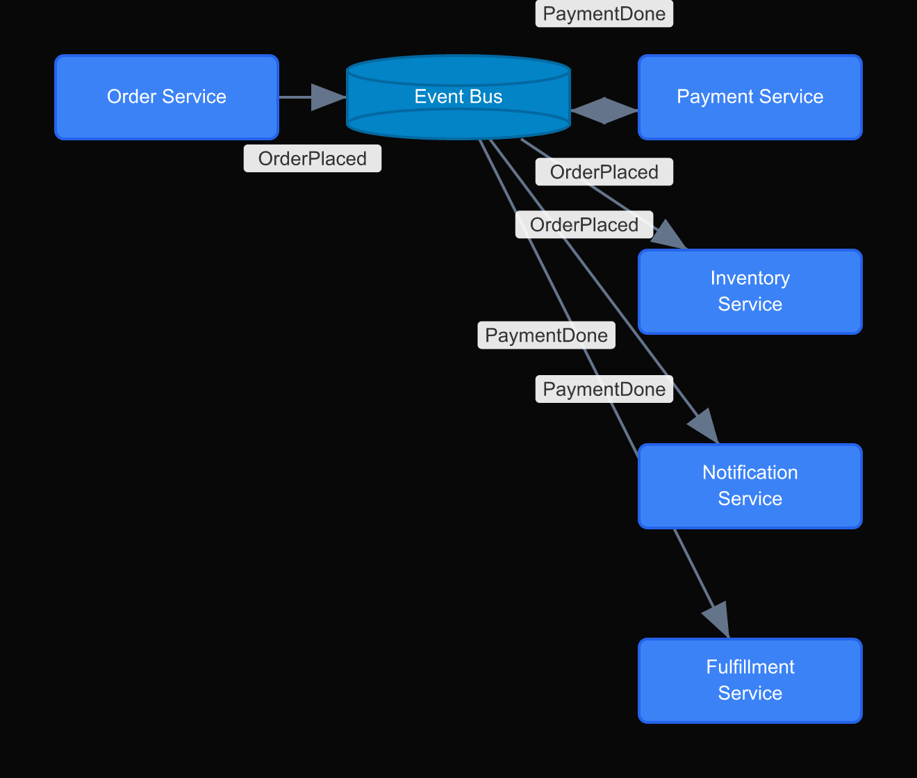
What the diagram immediately shows: which services are decoupled (they can change independently) and which are not (if the event schema changes, every consumer changes). The diagram also shows what happens when the bus goes down: everything stops. That is not obvious from a text description.
2. CQRS with separate read and write models
Command Query Responsibility Segregation separates the model used to write data from the model used to read it. The write model is normalized and consistent. The read model is denormalized and optimized for the specific query patterns your application needs.
Most developers who understand CQRS in theory still struggle to implement it correctly, because they are working from a mental model rather than a diagram. Draw it.
Draw two boxes: Write Model and Read Model. Draw a Command Handler that writes to the Write Model and publishes an event. Draw a Projection that consumes that event and updates the Read Model. Draw your API: write endpoints point to the Command Handler; read endpoints point to the Read Model directly.
The diagram makes the synchronization lag visible. There is a delay between a write and when the read model reflects it. That delay is acceptable for some use cases and unacceptable for others. The diagram forces that conversation before the implementation begins.
3. Saga pattern for distributed transactions
When a transaction spans multiple services (create order, charge payment, reserve inventory, send confirmation) you cannot use a database transaction. Each step might succeed while a later step fails. The saga pattern coordinates these steps and handles failures.
There are two saga variants: orchestrated (a central coordinator calls each step) and choreographed (each service publishes an event that triggers the next step). The diagrams for these are visually distinct, which is why drawing them before choosing matters.
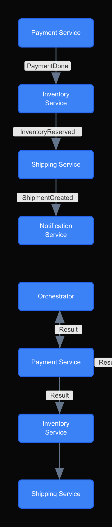
In the orchestrated diagram, the coordinator is a box with arrows to every other service. The failure paths all return to the coordinator. In the choreographed diagram, there is no central box. Each service has arrows to the event bus and from the event bus. The failure paths are harder to trace.
Most teams choose choreography because it sounds more elegant. After drawing both diagrams, many of them choose orchestration instead.
4. BFF (Backend for Frontend) pattern
Different clients have different data needs. A mobile app needs compact payloads with pre-aggregated data. A desktop web app needs richer data with more options. An internal admin dashboard needs data that the public API should never expose.
The BFF pattern creates a separate backend service for each frontend. Each BFF knows its client's needs and aggregates data from underlying services accordingly.
The diagram that makes this pattern legible: draw each client (Mobile App, Web App, Admin Dashboard) at the top. Below them, draw their corresponding BFF services. Below those, draw the shared backend services (User Service, Product Service, Order Service). Draw arrows showing which BFF calls which backend services.
The value of drawing this is that you can immediately see overlap and duplication. If the Mobile BFF and the Web BFF both call the same three services and transform the data the same way, maybe they should be one service. If they call completely different services, they are genuinely different things.
Why most developers skip the diagram and pay for it later
The honest reason developers do not draw architecture diagrams is that the design feels obvious to the person building it. When you are the one who chose to use an event bus instead of direct service calls, the diagram seems unnecessary. You already know why.
The diagram is not for you. It is for the engineer who joins three months later, or for you six months from now when the original reasoning has faded, or for the incident commander at 2am when something is broken and nobody can reconstruct the data flow from memory.
Architecture diagrams are institutional memory. They encode decisions that are invisible in the code itself. The code shows what the system does. The diagram shows why it is shaped the way it is.
The four patterns in this article are particularly important to diagram for this reason. Event-driven architecture, CQRS, saga, and BFF are all patterns where the implementation looks surprising if you do not know the pattern. A developer reading the code for the first time sees an event bus and wonders why the payment service does not call the shipping service directly. The diagram, with a note explaining the decoupling rationale, answers that question before it becomes a debugging detour.
This is why the diagram commitment in the repo is the right habit. Not because the diagram replaces the code review. Because the diagram preserves the reasoning that code review cannot capture.
Diagrams as architecture records
These patterns are not new. What is new is how quickly architectures change. A diagram from eighteen months ago may accurately describe the system that was built, but not the system running in production today.
The practice that works: every significant architecture decision gets a diagram committed to the repository. Not in Confluence. Not in a slide deck. In the repo, versioned alongside the code.
When the architecture changes, the diagram changes. The history is in git. The diagram is the documentation.
DrawIt makes this practical because diagrams are fast to create and easy to update. When you are refactoring a service or adding a new pattern, you update the diagram in the same session. That is a habit that compounds.